LARK HILL BREWERY
A university client that involved conceptualising twelve unique different brews all set to launch later in the year.
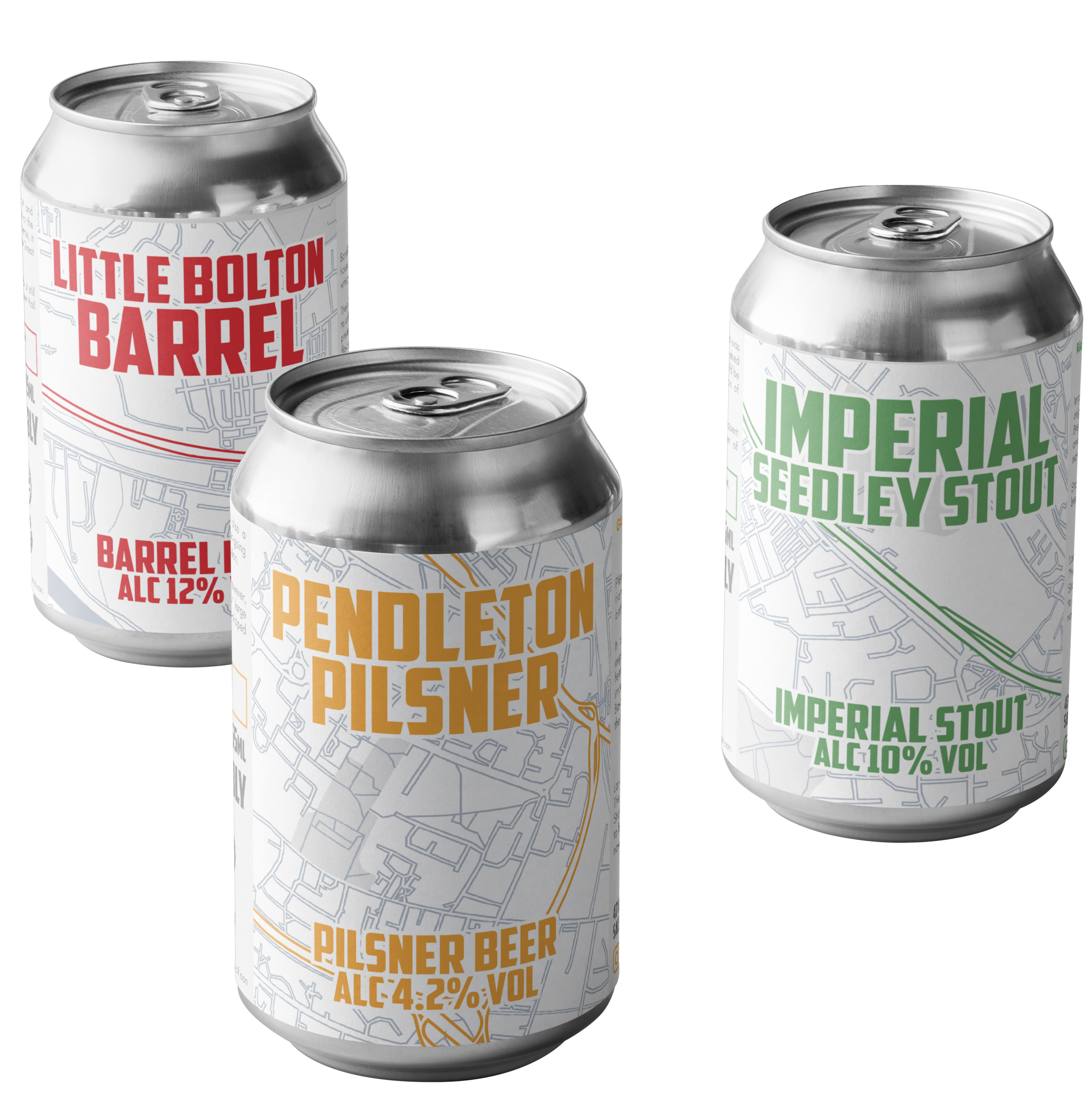
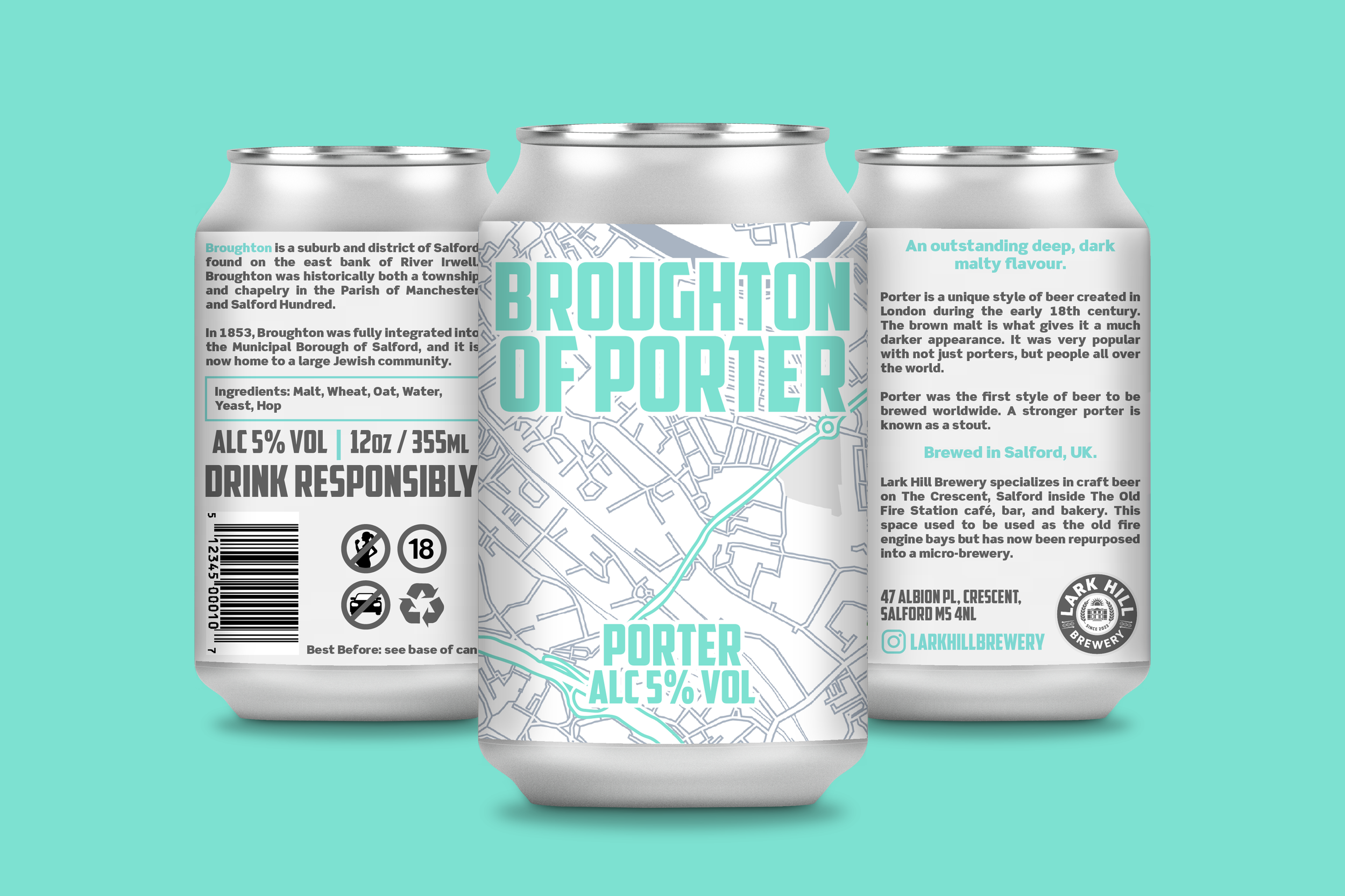
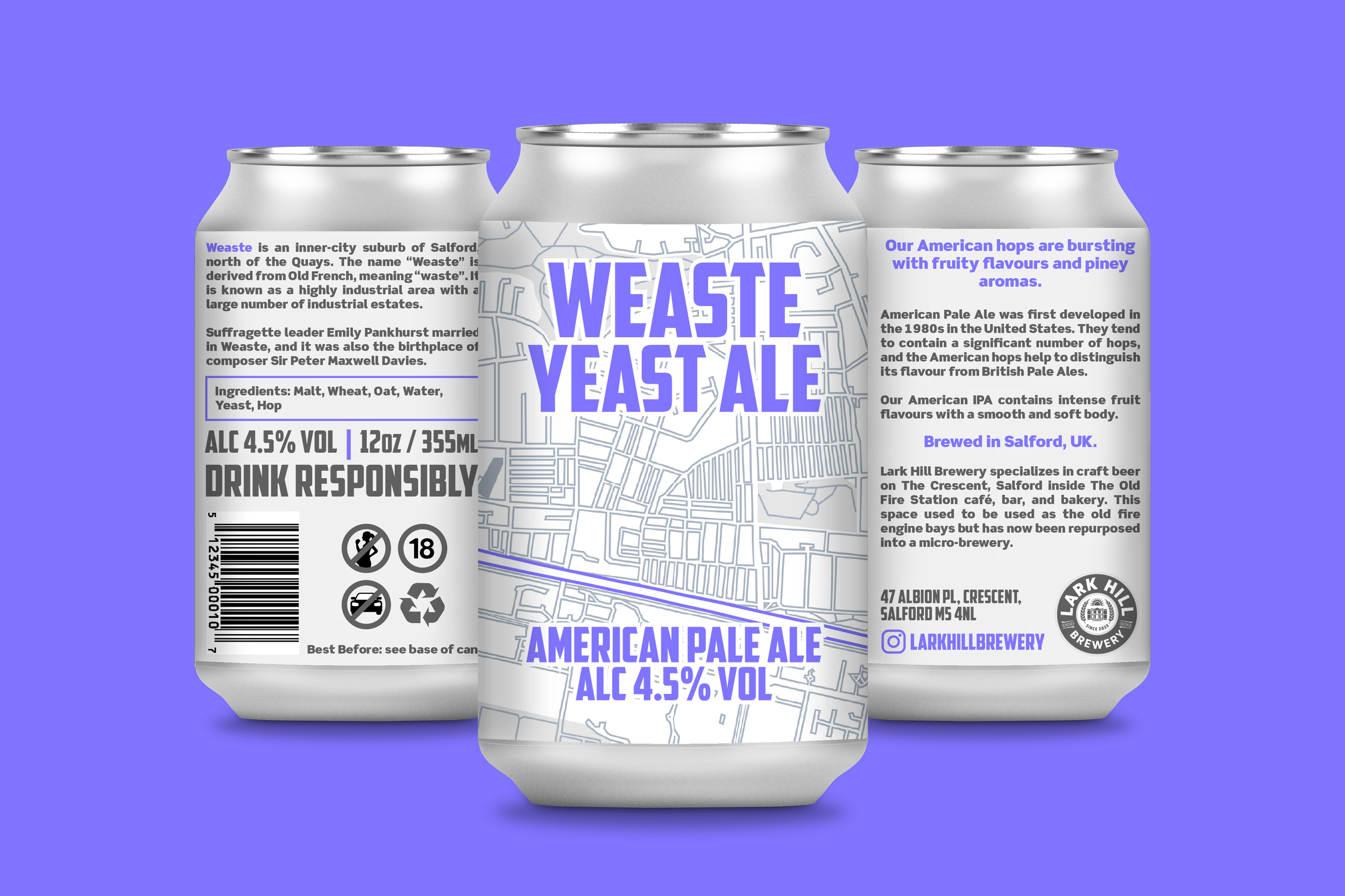
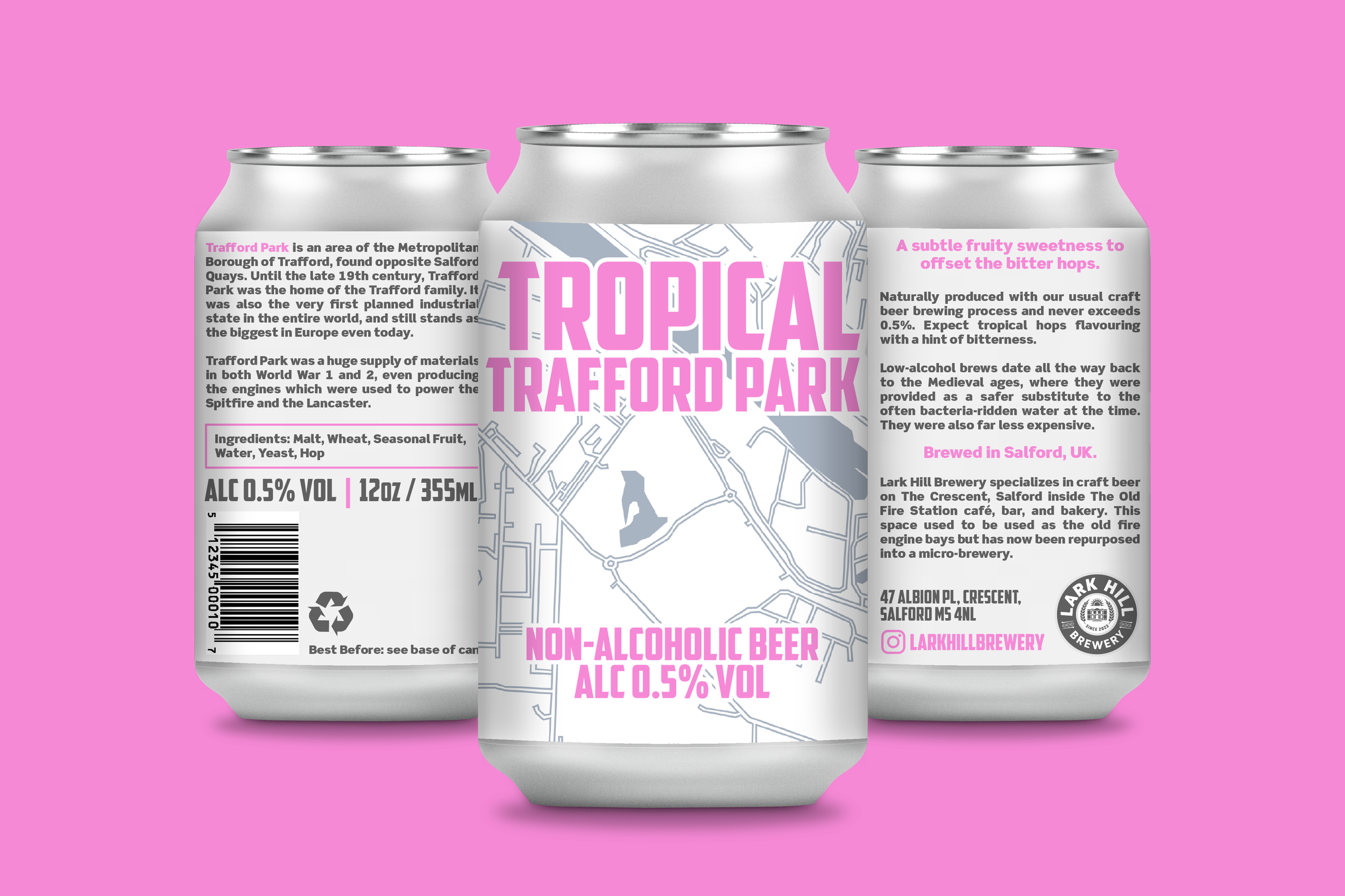
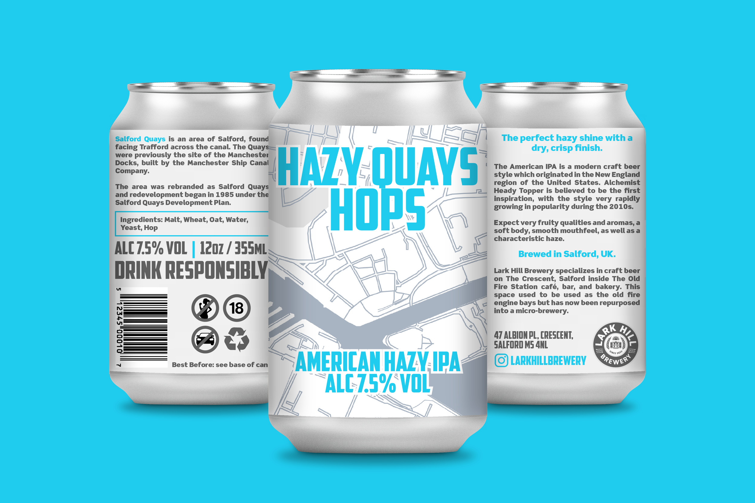
Responsibilities included designing creative labels and communication for each of Lark Hill's brews, appealing to customers with a clear, passionate, and relatable brand narrative.
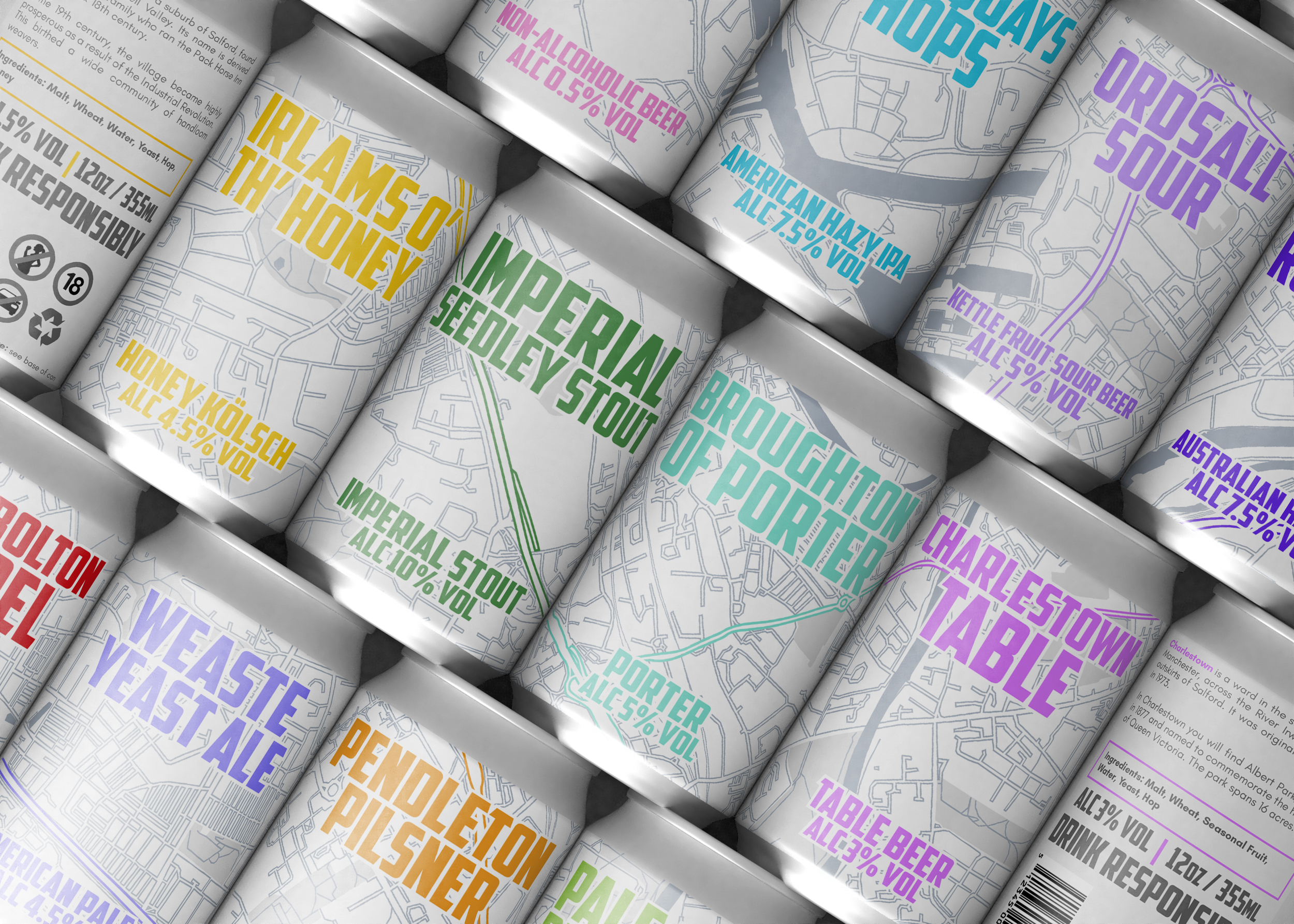
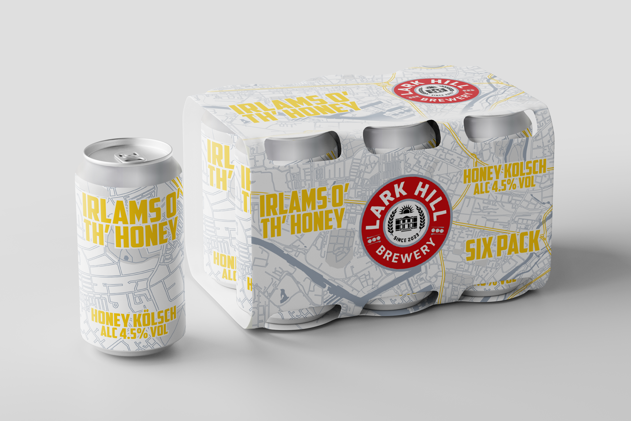
Further responsibilities for this project meant naming each brew, utilising a design system that connects all the brews together whilst keeping their individual personalities intact. I also had to consider how the brand story is delivered in a retail environment with good shelf presence, visibility, and differentiation.
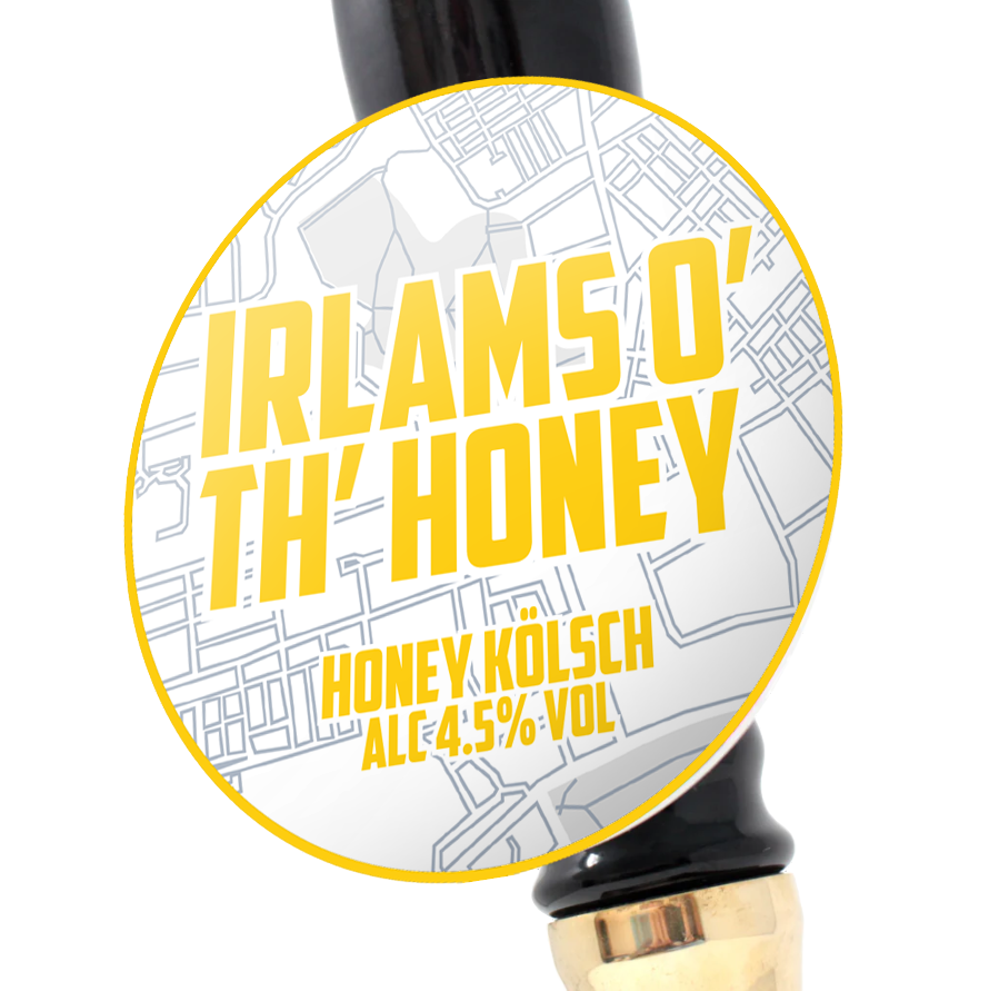
Furthermore, the project tasked me with appealing to the target audience through a social media campaign via Instagram, as well as designing the pump clips and multipack packaging. The idea was to make Salford (the beer's origin) the core theme of the design.

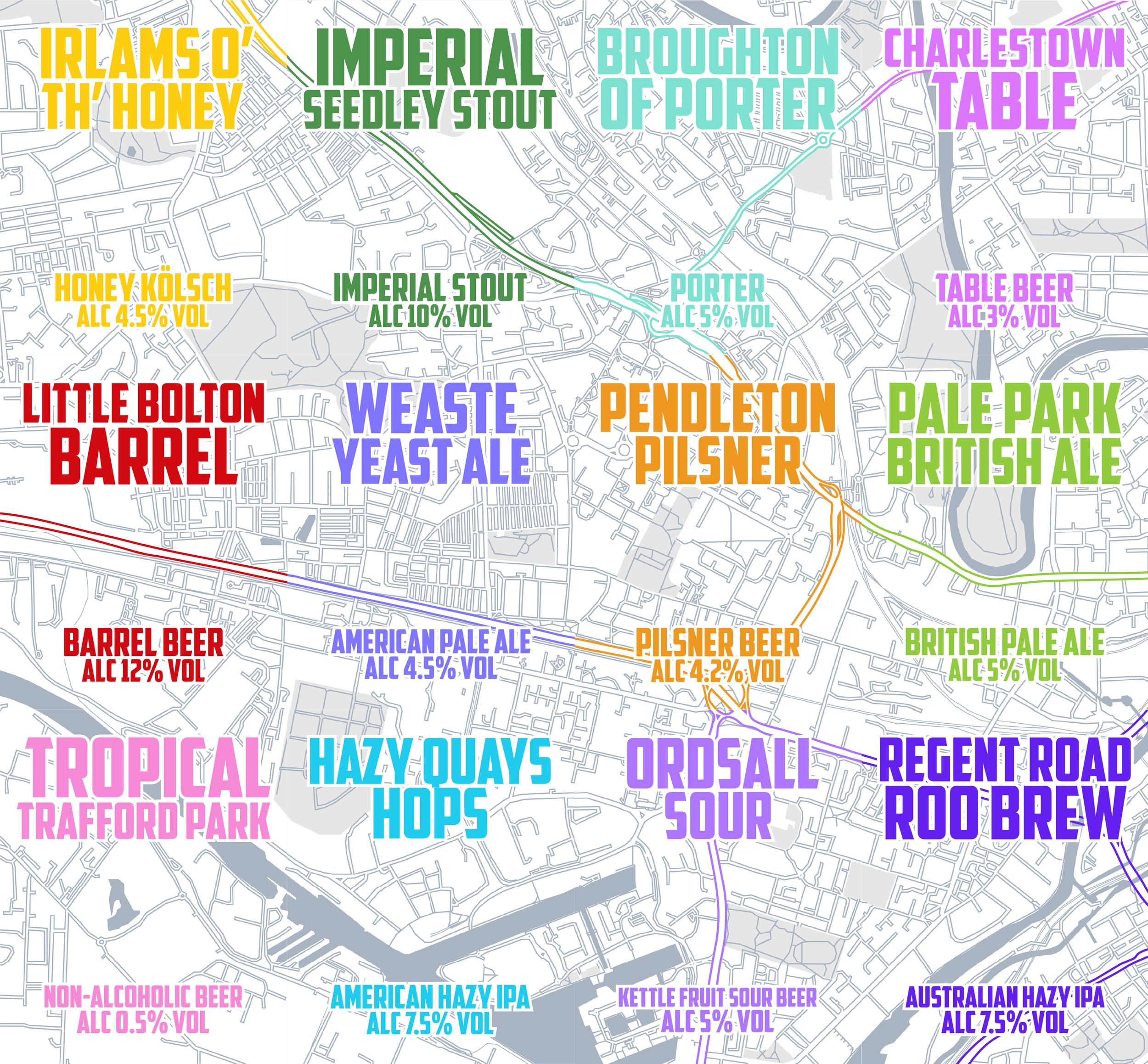
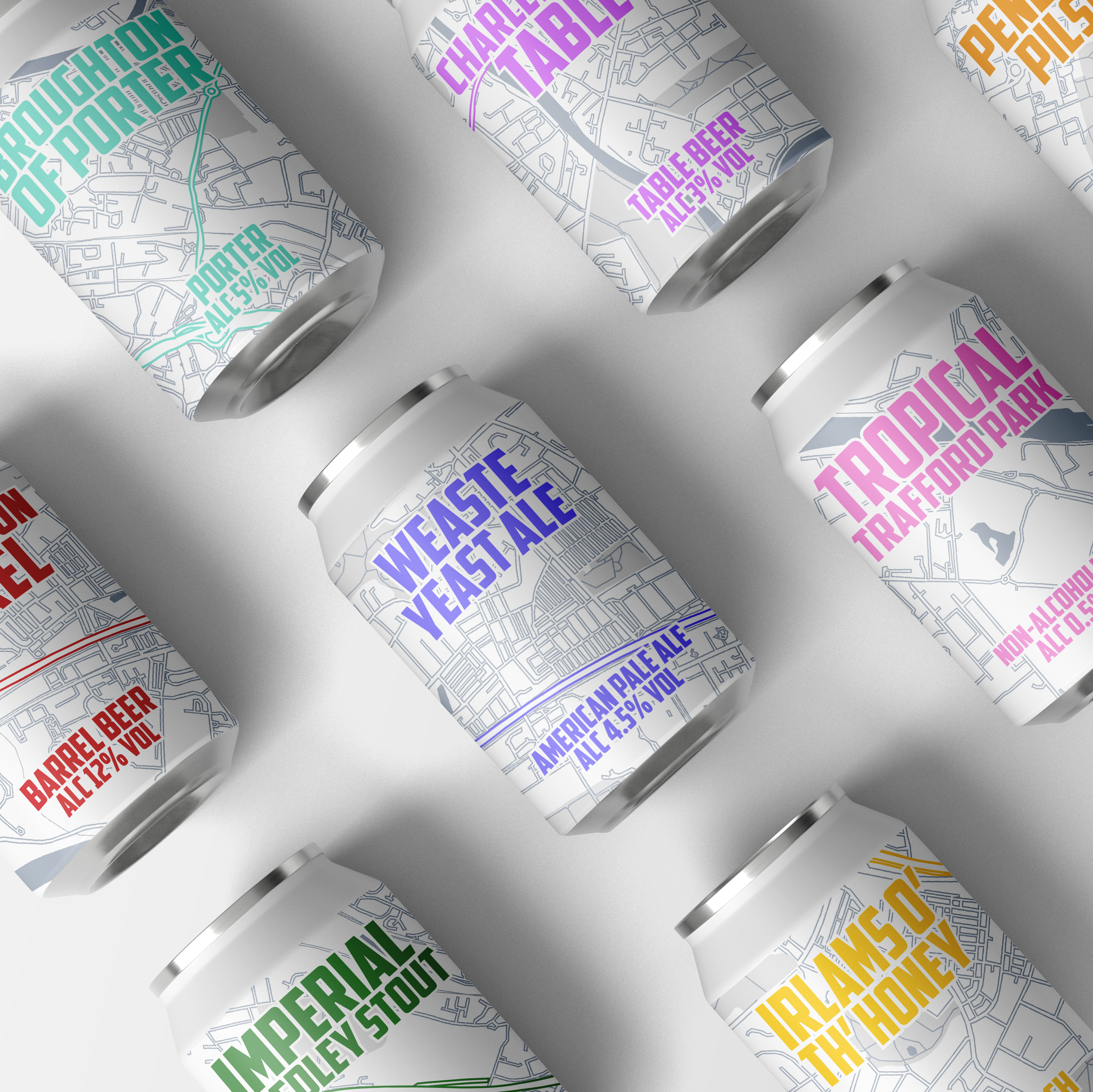
My main goal was to give the brand a sense of home. To build an identity around community and heart, with a strong implication of unique exclusivity; beer that could only have come from Salford and nowhere else. Together, the cans make a map of Salford, each can being named after an iconic locale in the area.
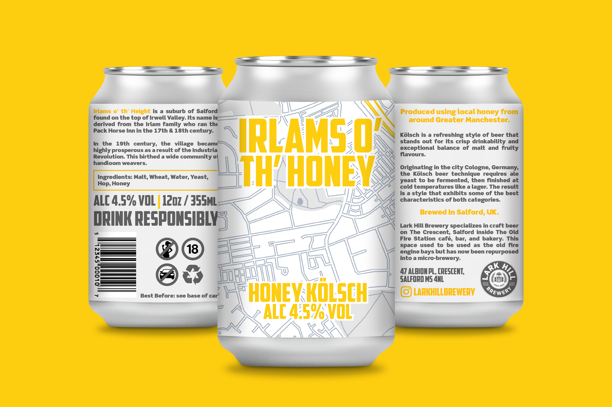
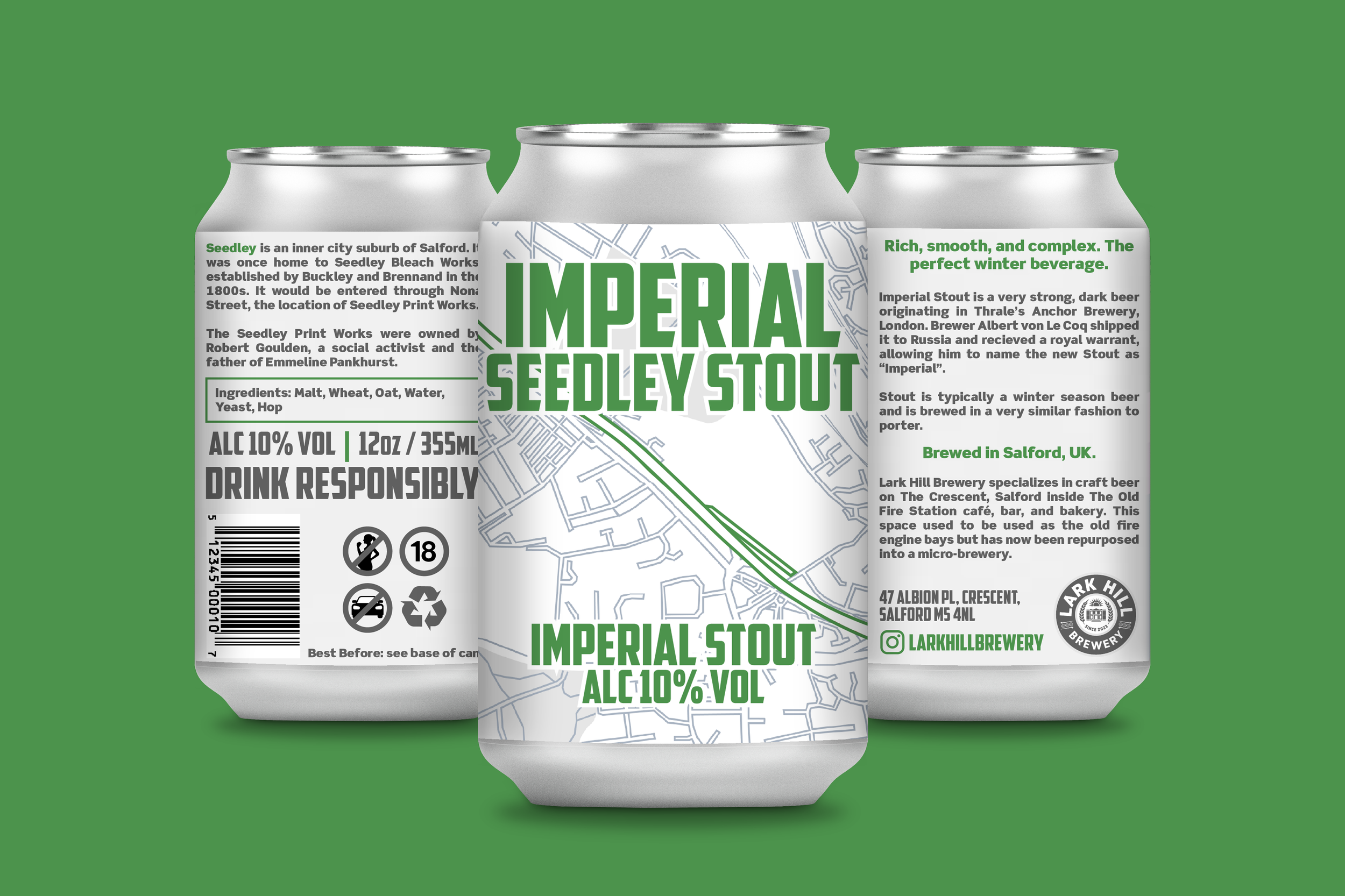

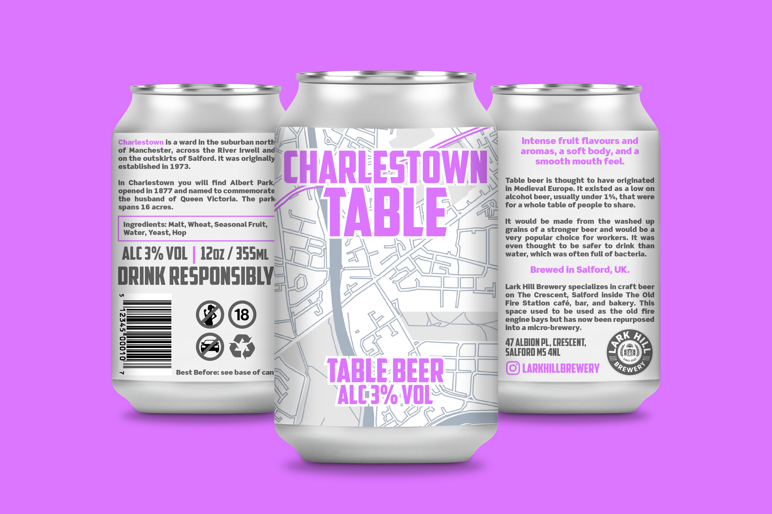
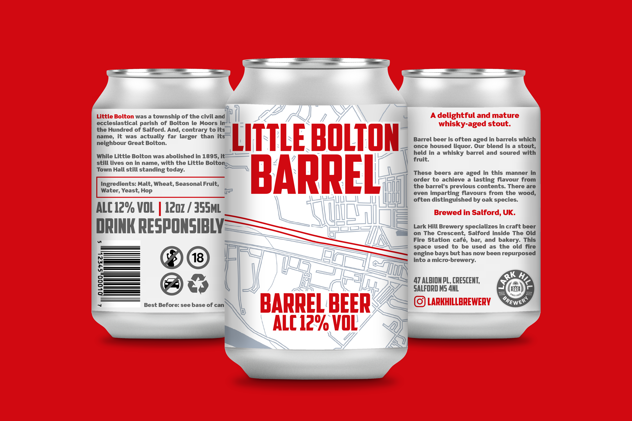

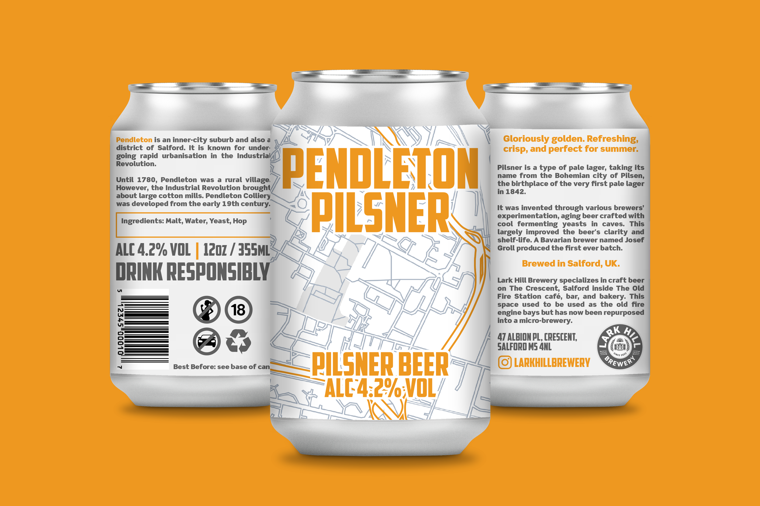
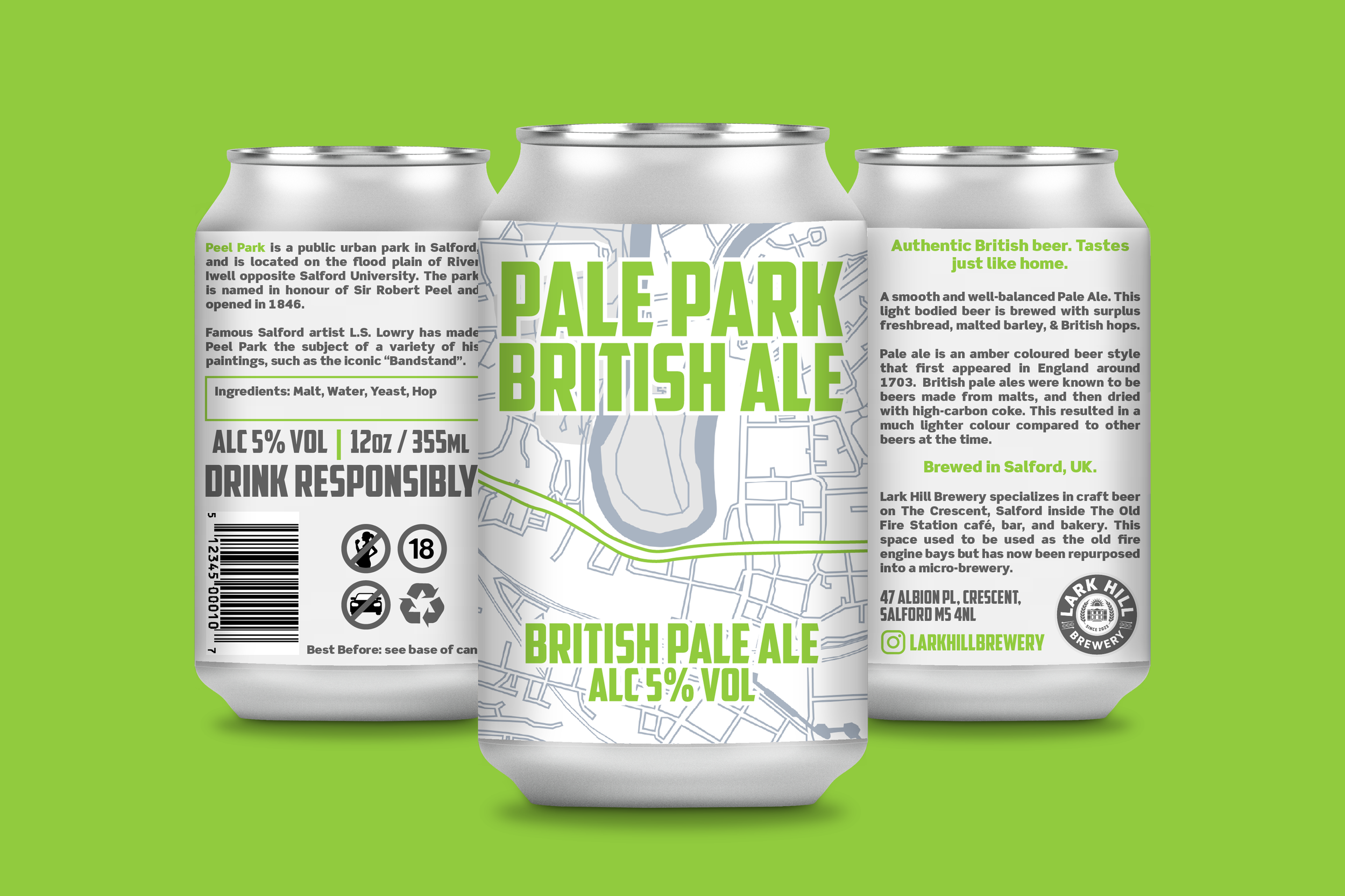


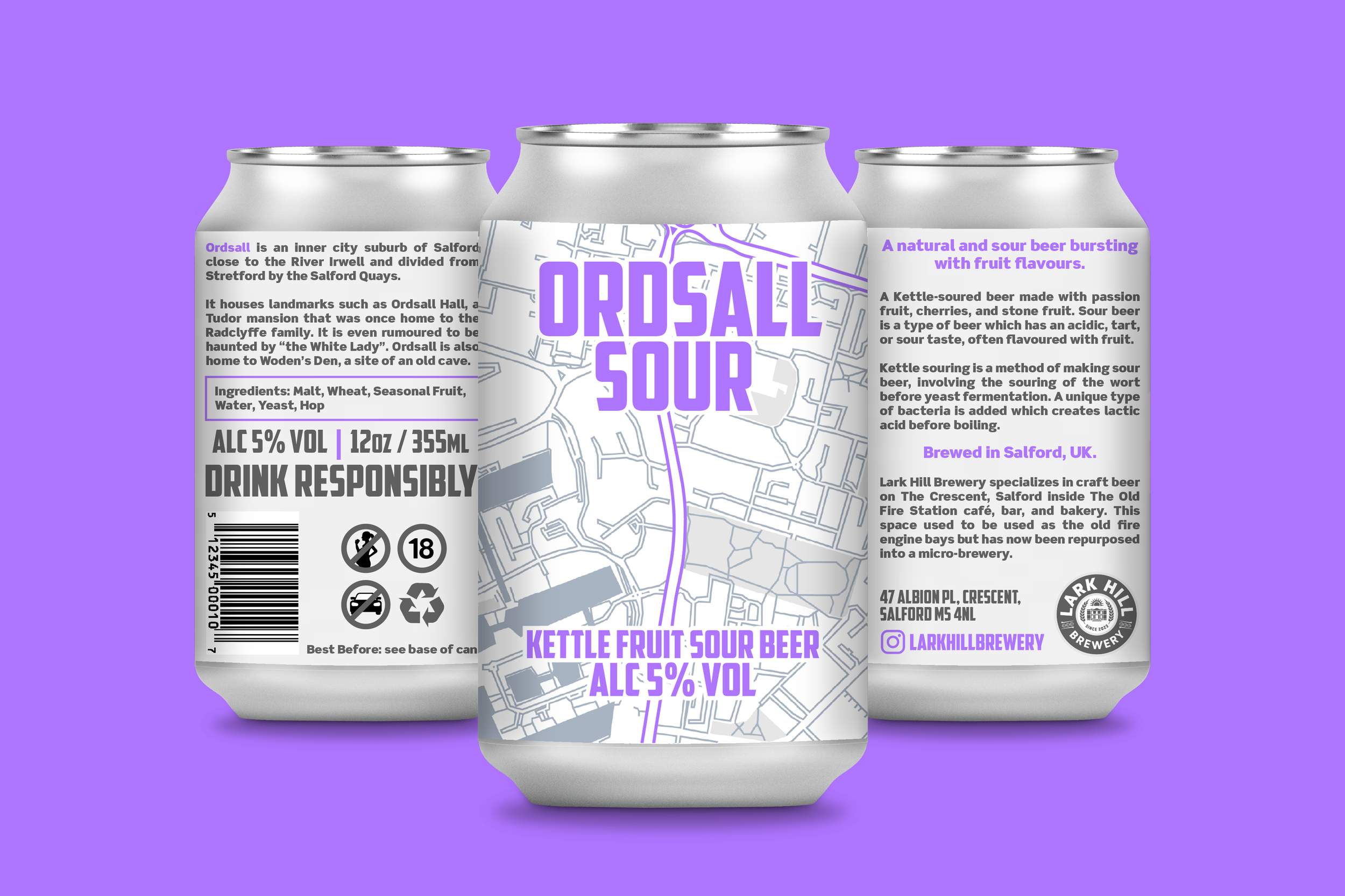
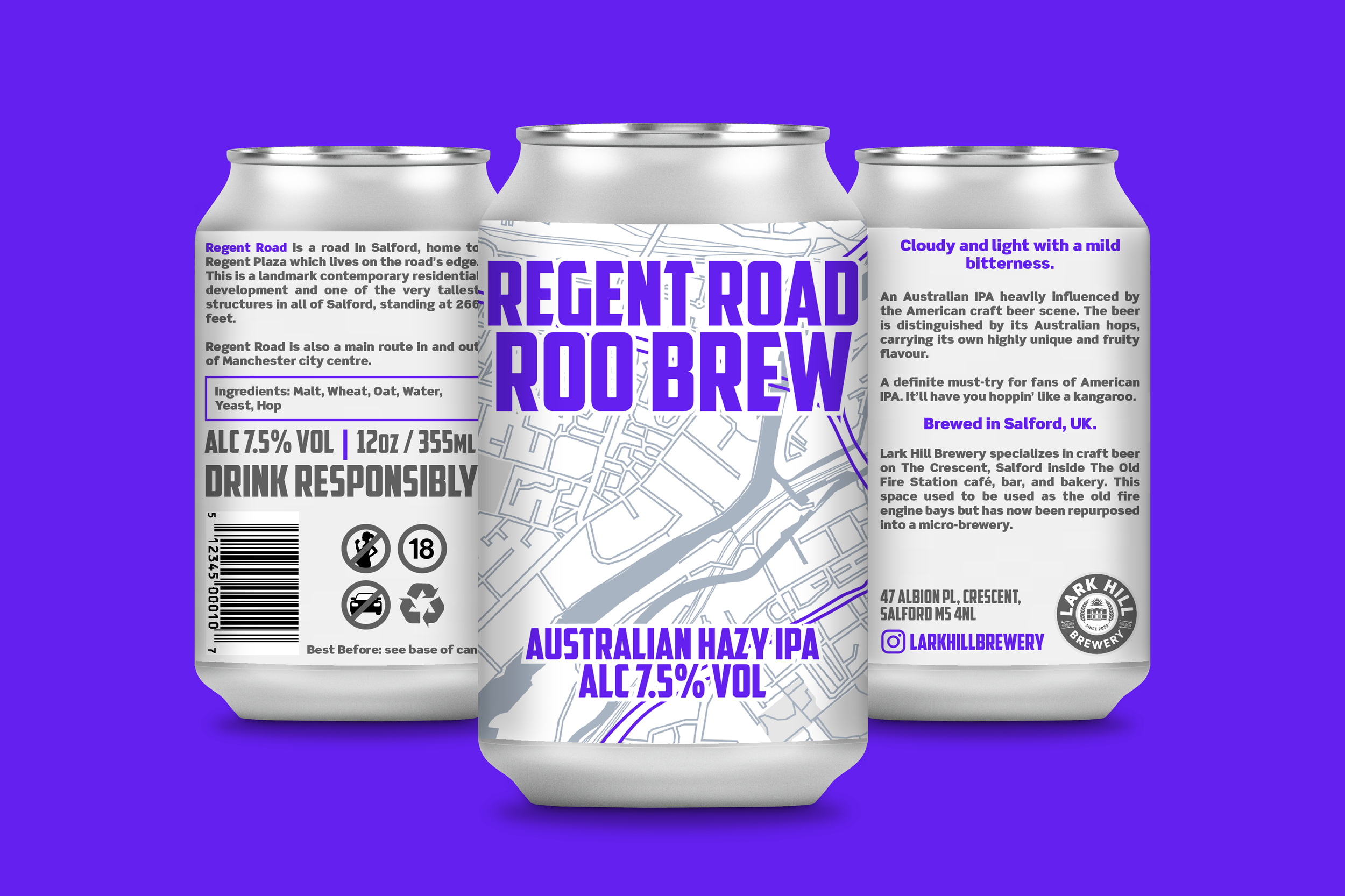

A university client that involved conceptualising twelve unique different brews all set to launch later in the year. Responsibilities included designing creative labels and communication for each of Lark Hill's brews, appealing to customers with a clear, passionate, and relatable brand narrative.
Further responsibilities for this project meant naming each brew, utilising a design system that connects all the brews together whilst keeping their individual personalities intact. I also had to consider how the brand story is delivered in a retail environment with good shelf presence, visibility, and differentiation.
Furthermore, the project tasked me with appealing to the target audience through a social media campaign via Instagram, as well as designing the pump clips and multipack packaging. The idea was to make Salford (the beer's origin) the core theme of the design.
My main goal was to give the brand a sense of home. To build an identity around community and heart, with a strong implication of unique exclusivity; beer that could only have come from Salford and nowhere else. Together, the cans make a map of Salford, each can being named after an iconic locale in the area.

